pkgs <- c("shiny", "bslib", "tidyverse",
"leaflet", "sf", "plotly",
"DT", "bsicons", "scales", "htmltools")
install.packages(
pkgs[!pkgs %in% rownames(installed.packages())]
)Building Interactive Malaria Dashboards with R Shiny
1 Setup
1.1 Create a project folder
Before writing any code, set up a clean project structure in RStudio:
File → New Project → New Directory → New Project
Name it malaria-shiny-hackathon and choose a sensible location on your computer.
Your project should have the following structure:
malaria-shiny-hackathon/
├── app.R          ← your Shiny app (create this)
├── data/          ← provided datasets go here
└── www/           ← logo and images go here
1.2 Required packages
Run this once in your console to install any missing packages:
Then load them at the top of every session:
library(shiny)
library(bslib)
library(tidyverse)
library(leaflet)
library(sf)
library(plotly)
library(DT)
library(bsicons)
library(scales)
1.3 Training dataset
For this session you will use a pre-prepared dataset for Burkina Faso covering 2020–2023. The dataset uses the real Burkina Faso district shapefile from the Malaria Atlas Project, with simulated malaria and intervention indicators that reflect realistic epidemiological patterns for the country.
ImportantDownload the training data
Download the three .rds files from the link below and save them into your project’s data/ folder before starting:
Your data/ folder should contain:
malaria_data.rds— monthly data for all districtsannual_summary.rds— annual KPI summariesbfa_districts.rds— Burkina Faso district shapefile
1.4 Load the data
At the top of your app.R, after loading packages, add:
# load training datasets
malaria_data <- readRDS("data/malaria_data.rds")
annual_df    <- readRDS("data/annual_summary.rds")
district_shp <- readRDS("data/bfa_districts.rds")
1.5 Quick data check
Run this in your console to confirm everything loaded correctly:
# monthly data
glimpse(malaria_data)

# how many districts and years?
cat("Districts:", n_distinct(malaria_data$district), "\n")
cat("Regions:",   n_distinct(malaria_data$region),   "\n")
cat("Years:",     unique(malaria_data$year),          "\n")
cat("Months:",    unique(malaria_data$month),         "\n")

# shapefile check
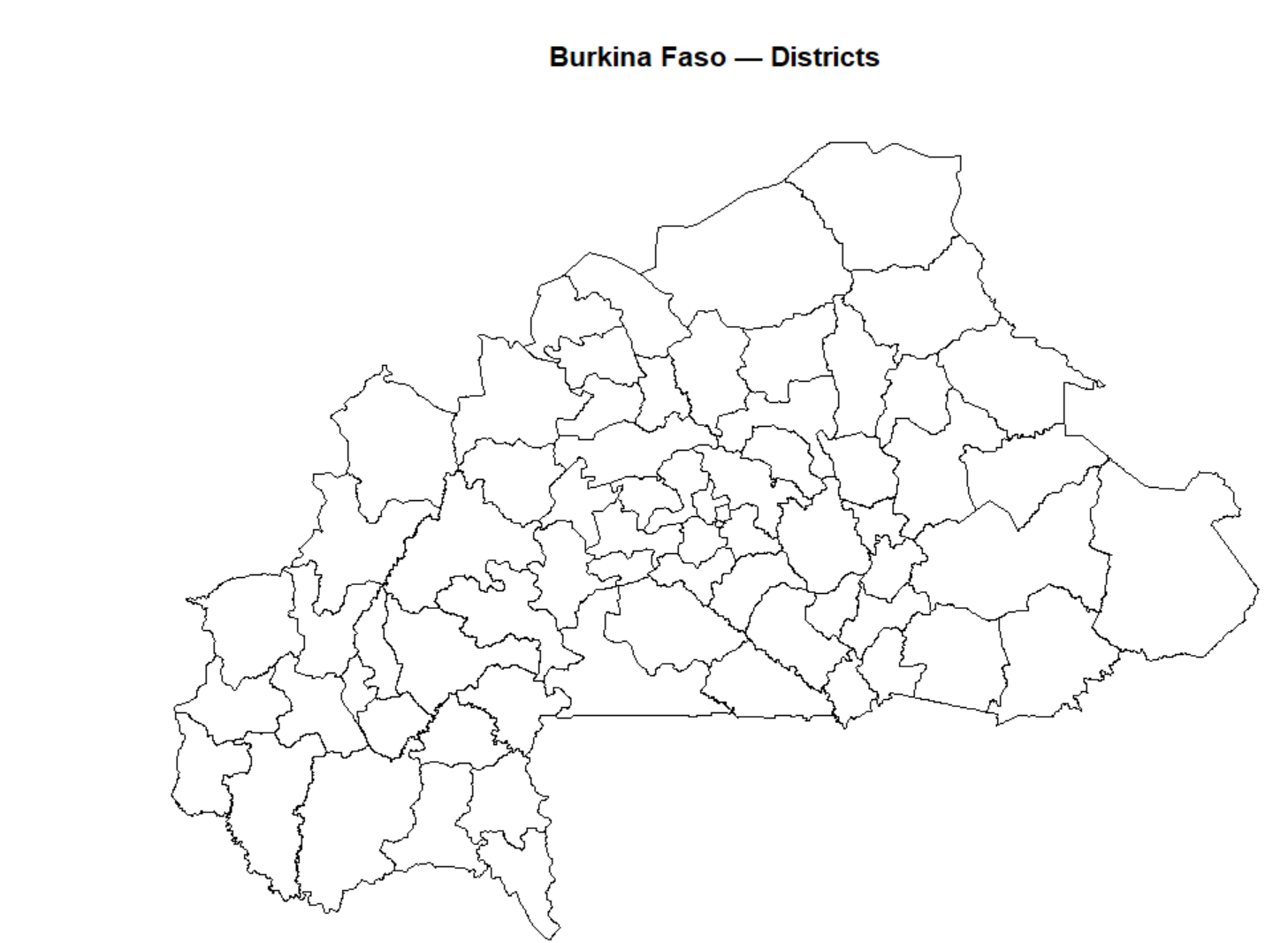
plot(sf::st_geometry(district_shp),
     main = "Burkina Faso — Districts")
You should see:
- 45 districts across 13 regions
- 4 years × 12 months = 2,160 rows per district
- A map of Burkina Faso districts
NoteAbout this dataset
The shapefile is real — downloaded from the Malaria Atlas Project using the malariaAtlas R package. The incidence, rainfall, and ITN coverage values are simulated to reflect realistic epidemiological patterns for Burkina Faso:
- Higher burden in the south and southwest (wetter, higher transmission)
- Lower burden in the north and Sahel (drier, lower transmission)
- Rainfall peaks July–August (Sahel wet season)
- Malaria incidence peaks September–October (6-week lag behind rainfall)
- ITN coverage improves gradually 2020–2023
2 What is Shiny?
Shiny is an R package developed by Posit (formerly RStudio) that lets you build interactive web applications directly from R — no HTML, CSS, or JavaScript knowledge required.
2.1 Why Shiny for malaria data?
Malaria programmes generate large volumes of subnational data — district-level incidence, rainfall, intervention coverage, health facility access. Static plots and reports are useful but limited: they show one view, fixed at the time of rendering.
Shiny changes that. Instead of sending a programme manager a PDF with 50 district plots, you give them a dashboard where they can:
- Select their district and year
- Explore trends interactively
- Zoom into the map
- Download the data they need
This is the kind of tool we are building today.
2.2 What does a Shiny app look like?
At its simplest, a Shiny app is a single file called app.R that lives in its own folder. It has three parts:
NoteThe three parts of every Shiny app
1. UI (User Interface) Defines what the user sees — the layout, input controls (dropdowns, sliders), and placeholders for outputs (maps, plots, tables).
2. Server Defines what the app does — filters data, builds plots, computes summaries, and sends results back to the UI.
3. shinyApp() The function that ties UI and server together and launches the app.
Here is the simplest possible Shiny app:
library(shiny)
# type “runExample(”01_hello”)”
# 1. UI — what the user sees
ui <- fluidPage(
  titlePanel("My first Shiny app"),

  sidebarLayout(
    sidebarPanel(
      sliderInput(
        inputId = "bins",
        label   = "Number of bins:",
        min = 1, max = 50, value = 30
      )
    ),
    mainPanel(
      plotOutput("histogram")
    )
  )
)

# 2. Server — what the app does
server <- function(input, output, session) {

  output$histogram <- renderPlot({
    hist(faithful$waiting,
         breaks = input$bins,
         col    = "steelblue",
         main   = "Waiting times",
         xlab   = "Minutes")
  })

}

# 3. Launch the app
shinyApp(ui, server)
3 Anatomy of a Shiny App
Now that you have seen a Shiny app run, let’s understand each part in detail before we start building our malaria dashboard.
3.1 Modern Shiny with bslib
The app above uses fluidPage() — the classic Shiny layout. In this session we use bslib instead, which gives us a more modern, responsive, and visually polished layout with very little extra code.
NoteWhat is bslib?
bslib is Posit’s modern UI toolkit for Shiny. It is built on Bootstrap 5 and replaces the older shinydashboard package. Key advantages:
- Cleaner, more professional look out of the box
- Easy theming with
bs_theme() - Modern components:
card(),value_box(),layout_columns() - Actively maintained and updated
3.2 The UI in depth
The UI is built by nesting R functions inside each other. Each function adds an element to the page — a title, a sidebar, a dropdown, a plot placeholder.
In bslib, the top-level layout function is page_sidebar():
ui <- page_sidebar(
  title = "My Dashboard",    # top navigation bar

  sidebar = sidebar(         # left panel
    "Sidebar content here"
  ),

  "Main content here"        # right panel
)
This gives you the classic two-pane layout — sidebar on the left, main content on the right.
3.2.1 Alternative layouts
page_sidebar() is not the only option. bslib provides several layout functions depending on what you need:
page_fluid() — a floating sidebar that grows with content rather than filling the page:
ui <- page_fluid(
  layout_sidebar(
    sidebar = sidebar("Sidebar"),
    "Main contents"
  )
)
page_navbar() — a multi-page layout with a navigation bar at the top, useful when your dashboard has several distinct sections:
ui <- page_navbar(
  title = "Malaria Dashboard",

  nav_panel("Overview",  "Overview content"),
  nav_panel("Districts", "District content"),
  nav_panel("About",     "About this app")
)
NoteWhich layout to use?
| Layout | Best for |
|---|---|
page_sidebar() |
Single-page dashboards with filters |
page_fluid() |
Flexible layouts that grow with content |
page_navbar() |
Multi-section dashboards with tabs |
For our malaria dashboard we use page_sidebar().
3.2.2 Cards
Cards are the core building block of a modern dashboard. They group related content in a clean bordered container.
card(
  "Card content"
)
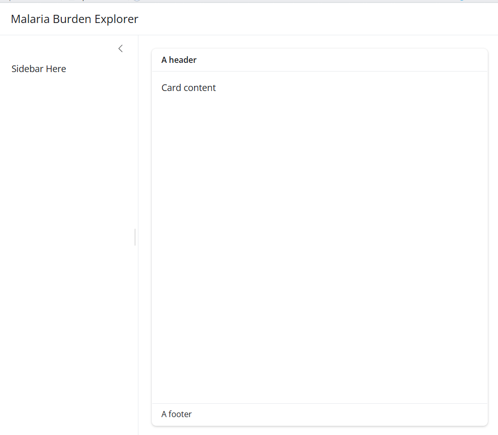
Add structure to a card using card_header(), card_body() and card_footer():
card(
  card_header("A header"),
  card_body("Card content"),
  card_footer("A footer")
)
Add full_screen = TRUE to let users expand the card to fill the browser window — essential for maps and charts:
card(
  full_screen = TRUE,
  card_header("Incidence map"),
  card_body(leafletOutput("map"))
)
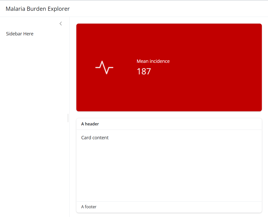
3.2.3 Value boxes
Value boxes highlight a single important number with an icon and a theme colour:
value_box(
  title    = "Mean incidence",
  value    = 187,
  showcase = bs_icon("activity"),
  theme    = "danger"
)
Available themes: "danger", "warning", "success", "info", "primary", "secondary", or Bootstrap colours like "teal", "purple".
TipBrowsing icons
Use bsicons::bs_icon() for icons. Browse the full library at icons.getbootstrap.com — search for any concept and copy the icon name.
3.2.4 layout_columns() — side by side
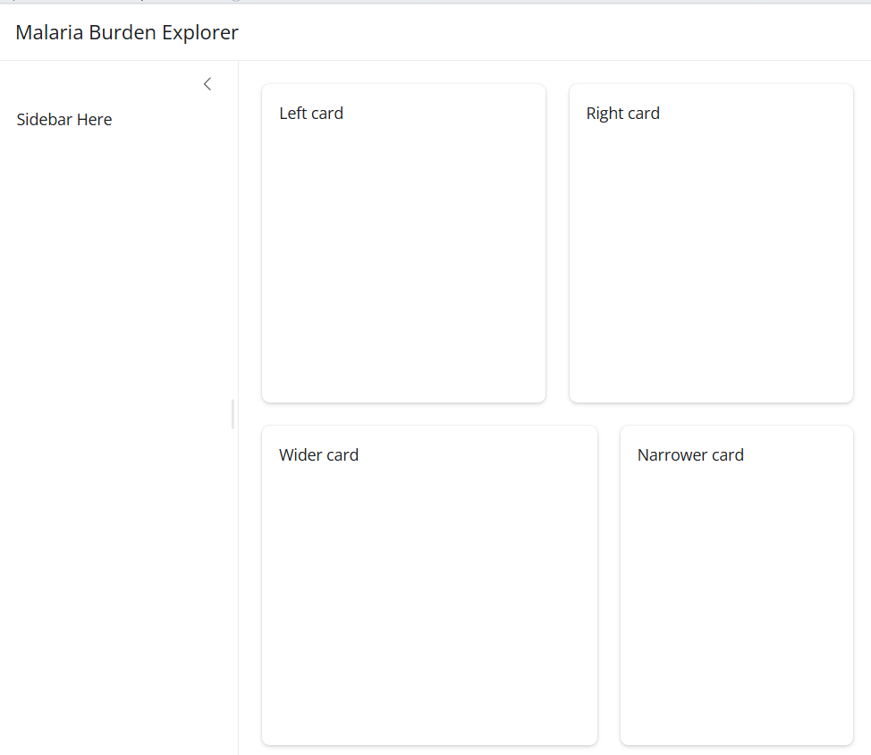
By default elements stack vertically. Wrap them in layout_columns() to place them side by side:
# equal split
layout_columns(
  card("Left card"),
  card("Right card")
)

# unequal split — 12 columns total
layout_columns(
  col_widths = c(7, 5),
  card("Wider card"),
  card("Narrower card")
)
NoteThe 12-column grid
Shiny divides the page into 12 columns. col_widths = c(7, 5) means the first element gets 7/12 of the width and the second gets 5/12. They must add up to 12.
Common splits:
| Split | col_widths |
|---|---|
| Equal halves | c(6, 6) |
| Two thirds / one third | c(8, 4) |
| Three equal columns | c(4, 4, 4) |
4 Inputs
Inputs are how users talk to your app. When a user changes a dropdown or moves a slider, Shiny passes that value to the server as input$inputId.
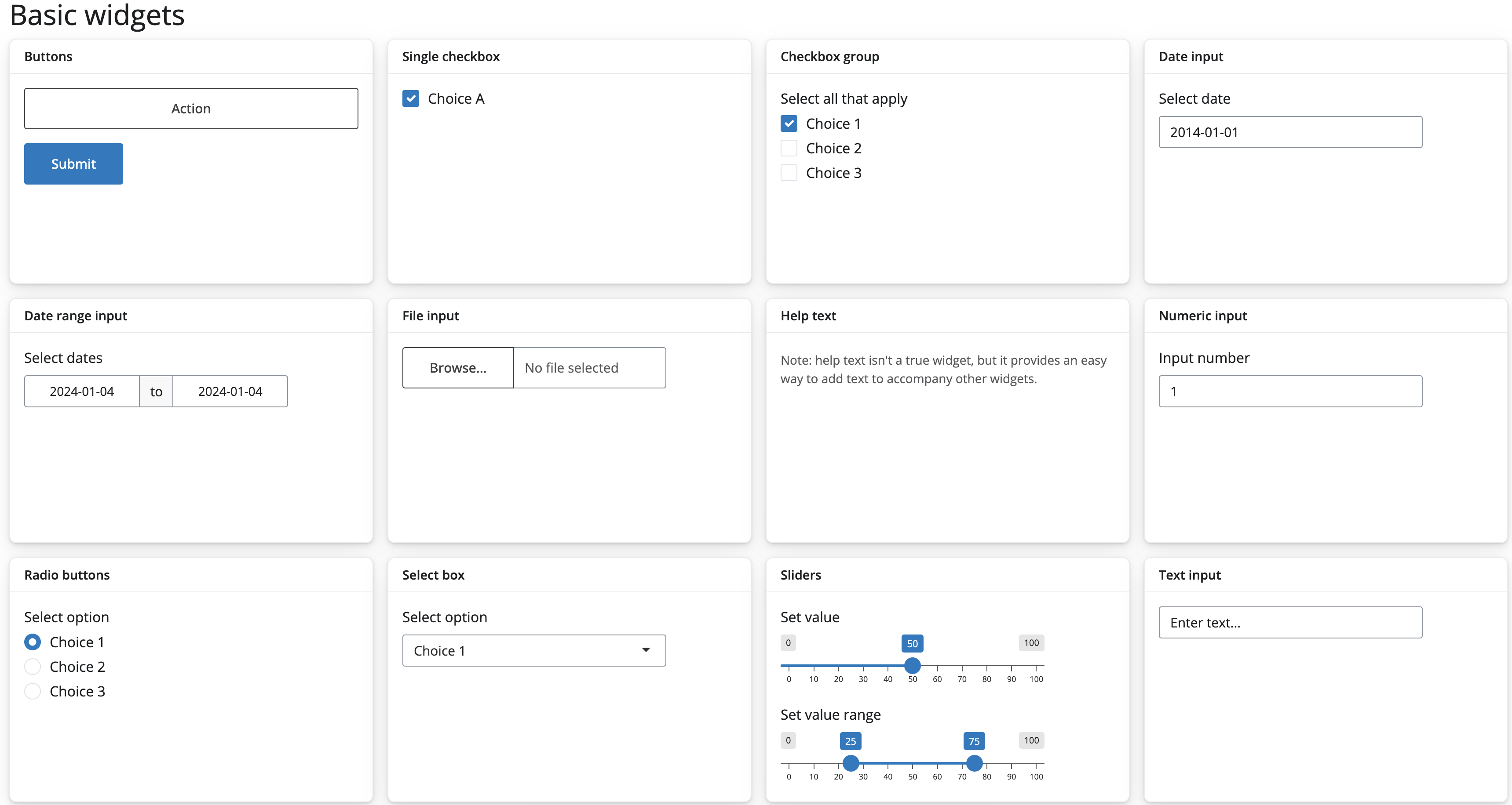
NoteThree things every input needs
inputId— unique name, accessed in server asinput$inputIdlabel— text shown above the control- A value —
choices,value, ormin/max
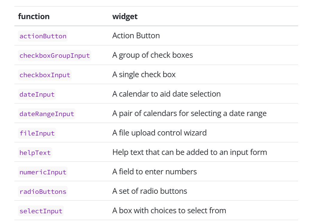
4.1 Input functions and their widgets
Shiny provides a family of input functions. Each function creates a different type of control widget in the UI:
4.2 Some Input types
4.2.1 selectInput() — dropdown
selectInput(
  inputId  = "year",
  label    = "Year",
  choices  = c(2020, 2021, 2022, 2023),
  selected = 2023
)
Add multiple = TRUE to allow selecting more than one option.
4.2.3 sliderInput() — numeric range
sliderInput(
inputId = "threshold",
label = "High burden threshold",
min = 0,
max = 500,
value = 200,
step = 10
)Pass two values to value for a range slider: value = c(100, 400).
4.3 conditionalPanel() — dynamic inputs
Show an input only when another input has a specific value:
sidebar = sidebar(
radioButtons(
  inputId  = "admin_level",
  label    = "Display level",
  choices  = c("Region", "District"),
  selected = "District",
  inline   = TRUE
),
# only shows when District is selected
conditionalPanel(
condition = "input.admin_level == 'District'",
selectInput(
inputId = "district",
label = "District",
choices = sort(unique(malaria_data$district)),
selected = "District 1"
)
)
)
NoteJavaScript dot notation
Inside conditionalPanel() use input.admin_level not input$admin_level — the condition runs in the browser using JavaScript, not R.
Exercise 1
1a. Add a checkboxInput() with inputId = "show_rainfall", label “Show rainfall line”, ticked by default.
1b. Add a conditionalPanel() that shows a region selectInput() only when input.admin_level == 'Region'.
CautionShow solution
2a.
checkboxInput(
  inputId = "show_rainfall",
  label   = "Show rainfall line",
  value   = TRUE
)
2b.
conditionalPanel(
  condition = "input.admin_level == 'Region'",
  selectInput(
    inputId  = "region",
    label    = "Region",
    choices  = sort(unique(malaria_data$region)),
    selected = "Northern"
  )
)
4.4 Pause and check ✅
5 Outputs and Reactivity
This is the most important section in the document. Everything in the dashboard build depends on understanding how outputs and reactivity connect.
5.1 How outputs work in Shiny
Creating an output in Shiny is always a two-step process:
Step 1 — Add a placeholder to the UI telling Shiny where to display the output.
Step 2 — Tell Shiny how to build the output in the server function.
5.2 Output types
Outputs in the UI create place holders that are later filled by the server function. Instead of an inputId, outputs take an outputId. If the UI has an output with ID plot, it can be accessed in the server function with output$plot.
Each output function in the UI has a corresponding render function in the server function.
There are three main types of output:
- plots
- tables
- text
Shiny provides a family of functions that turn R objects into browser-ready outputs. Every output type has:
- One display function → goes in the UI
- One render function → goes in the server
- A shared
outputId→ connects the two
| Output type | Render function (server) | Display function (UI) | When to use |
|---|---|---|---|
| Text | renderText() |
textOutput() |
Simple text strings |
| Static table | renderTable() |
tableOutput() |
Small fixed tables |
| Interactive table | renderDT() |
DTOutput() |
Sortable, searchable tables |
| Static plot | renderPlot() |
plotOutput() |
ggplot, base R plots |
| Interactive plot | renderPlotly() |
plotlyOutput() |
Hover, zoom, pan |
| Leaflet map | renderLeaflet() |
leafletOutput() |
Interactive maps |
| Image | renderImage() |
imageOutput() |
PNG, JPG files |
| Dynamic UI | renderUI() |
uiOutput() |
Generate UI on the fly |
| Value box | (no render function) | value_box() |
Single KPI highlights |
5.3 Building your first output — UI and server crosstalk
Let us work through a concrete example. We will add a text output to one of our dashboard cards that shows a data summary.
Our goal: display a sentence showing which year and how many districts are in the current dataset.
5.3.1 Step 1 — Add a placeholder in the UI
Inside one of your card() containers, replace the placeholder text with a textOutput():
card(
  card_header("Data summary"),
  card_body(
    textOutput("date_summary")   # ← placeholder
  )
)
The string "date_summary" is the outputId. The user never sees this — it is the bridge between UI and server.
5.3.2 Step 2 — Build the output in the server
Inside your server function, add:
server <- function(input, output, session) {

  output$date_summary <- renderText({
    "Data covers Burkina Faso districts,
     2020 to 2023"
  })

}
5.4 Making it reactive
Right now the text is fixed — it never changes. Let us connect it to input$year so it updates when the user changes the year dropdown.
Update your server:
output$date_summary <- renderText({
  paste0(
    "Showing data for: ", input$year,
    " | Burkina Faso"
  )
})
Run your app. Change the year dropdown — the sentence updates automatically.
5.5 render functions — what they actually do
A render function has two jobs:
- Generate something to display — a plot, map, table, or piece of text.
- Automatically regenerate it whenever one of its inputs changes.
That second job is what makes Shiny feel alive. The technical term is a reactive context — but the practical meaning is: Shiny watches what you read inside a render function and re-runs the function whenever those values change.
5.6 reactive() — filter once, use everywhere
5.6.1 What are reactive expressions?
Reactive expressions are R expressions that take reactive inputs and return a value.
They serve as a bridge between user inputs (like sliders, buttons, or text inputs) and the outputs (such as plots, tables, or text) in your Shiny app.
When an input changes, the related reactive expressions automatically update their values.
5.6.2 Reactive expressions
We will consider two reactive expressions:
reactive():
- It allows you to defi ne a computation that depends on reactive inputs (such as user interactions) and returns a value.
- When any of its dependencies change, the reactive expression is automatically re-evaluated.
eventReactive():
- The eventReactive() function is similar to reactive(), but with a specific trigger event.
- It allows you to create a reactive expression that updates only when a specific event occurs (e.g., button click).
5.7 observeEvent() — reacting without an output
Sometimes you want to react to an input but not produce a visible output — for example, updating a dropdown list when another dropdown changes.
# when region changes, update district choices
observeEvent(input$region, {

  choices <- if (input$region == "All regions") {
    sort(unique(malaria_data$district))
  } else {
    malaria_data |>
      filter(region == input$region) |>
      pull(district) |> unique() |> sort()
  }

  updateSelectInput(
    session  = session,
    inputId  = "district",
    choices  = choices,
    selected = choices[1]
  )

})
Noteobserve() vs observeEvent()
observe()— re-runs when ANY reactive value inside it changesobserveEvent(input$x, {...})— re-runs only wheninput$xspecifically changes
Use observeEvent() — it is explicit and predictable.
Exercise 3
3a. Add a renderText() output that shows the number of districts currently in the filtered data. Display it with textOutput() below the slider in the sidebar.
3b. Add a renderDT() output showing a summary table of mean incidence and mean ITN coverage per district. Place it in a new card below the trend placeholder.
3c. Add an observeEvent() that updates the district dropdown when the region changes — so only districts in the selected region appear.
CautionShow solution
3a. UI — add below sliderInput():
hr(),
textOutput("sidebar_summary")
Server:
output$sidebar_summary <- renderText({
  paste0(
    n_distinct(filtered_data()$district),
    " districts selected"
  )
})
3b. UI — add new card:
card(
  card_header("District summary"),
  card_body(DTOutput("data_table"))
)
Server:
output$data_table <- renderDT({
  filtered_data() |>
    group_by(district, region) |>
    summarise(
      mean_inc = round(
        mean(incidence,    na.rm = TRUE), 1),
      mean_itn = round(
        mean(itn_coverage, na.rm = TRUE), 1),
      .groups  = "drop"
    ) |>
    arrange(desc(mean_inc)) |>
    datatable(
      rownames = FALSE,
      options  = list(pageLength = 10)
    )
})
3c.
observeEvent(input$region, {
  choices <- if (input$region == "All regions") {
    sort(unique(malaria_data$district))
  } else {
    malaria_data |>
      filter(region == input$region) |>
      pull(district) |> unique() |> sort()
  }
  updateSelectInput(
    session  = session,
    inputId  = "district",
    choices  = choices,
    selected = choices[1]
  )
})
5.8 Pause and check ✅
6 Stage 1: Layout skeleton
Now we start writing actual app code. In this section we build the skeleton of our malaria dashboard — the layout structure with no data or reactivity yet. By the end you will have a running app that looks like a real dashboard.
6.1 Create your app.R file
In your project folder, create a new R script and save it as app.R. This is where all your app code lives.
Start with this skeleton — copy it exactly:
# ── packages ────────────────────────────────────────
library(shiny)      # core package — builds the interactive web app
library(bslib)      # modern UI layout and theming (Bootstrap 5)
library(tidyverse)  # data wrangling and ggplot2 for plotting
library(leaflet)    # interactive maps
library(sf)         # reads and handles shapefiles (spatial data)
library(plotly)     # converts ggplot charts to interactive plots
library(DT)         # interactive sortable and searchable tables
library(bsicons)    # Bootstrap icons for value boxes and UI elements
library(scales)     # formats numbers (commas, percentages, currency)
library(htmltools)  # renders HTML in leaflet hover labels

# ── load data ───────────────────────────────────────
malaria_data <- readRDS("data/malaria_data.rds")
annual_df    <- readRDS("data/annual_summary.rds")
district_shp <- readRDS("data/bfa_districts.rds")

# ── ui ──────────────────────────────────────────────
ui <- page_sidebar(
  title = "Malaria Burden Explorer",

  sidebar = sidebar(
    "Filters go here"
  ),

  "Main content goes here"
)

# ── server ──────────────────────────────────────────
server <- function(input, output, session) {

}

# ── launch ──────────────────────────────────────────
shinyApp(ui, server)
Click Run App in RStudio. You should see a plain page with a sidebar on the left and a main panel on the right.
6.3 Adding cards
Cards are the building blocks of a modern dashboard. They are bordered containers that group related content.
Update your UI to replace "Main content goes here" with this:
ui <- page_sidebar(
  title = "Malaria Burden Explorer",

  sidebar = sidebar(
    "Filters go here"
  ),

  # ── row 1: value boxes ──────────────────────────
  layout_columns(
    value_box(
      title    = "Mean incidence per 1,000",
      value    = "—",
      showcase = bs_icon("activity"),
      theme    = "danger"
    ),
    value_box(
      title    = "High burden districts",
      value    = "—",
      showcase = bs_icon("exclamation-triangle"),
      theme    = "warning"
    ),
    value_box(
      title    = "People at high risk",
      value    = "—",
      showcase = bs_icon("people-fill"),
      theme    = "success"
    )
  ),

  # ── row 2: map + bar chart ───────────────────────
  layout_columns(
    card(
      full_screen = TRUE,
      card_header("Incidence by district"),
      card_body(
        leafletOutput("map", height = 380)
      )
    ),
    card(
      full_screen = TRUE,
      card_header("Top districts by burden"),
      card_body(
        plotlyOutput("bar_chart", height = 380)
      )
    )
  ),

  # ── row 3: trend panel ───────────────────────────
  card(
    full_screen = TRUE,
    card_header(
      "Monthly incidence & rainfall"
    ),
    card_body(
      plotlyOutput("trend_chart", height = 300)
    )
  )
)
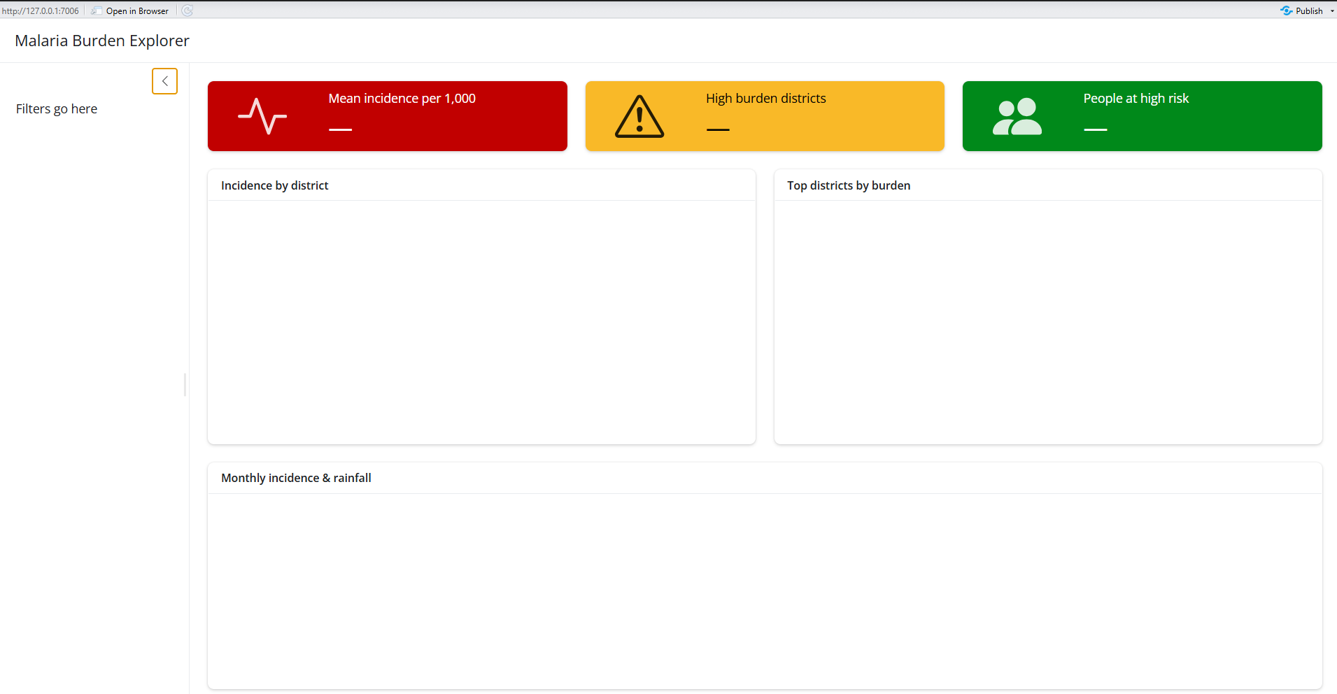
Refresh your app. You should now see:
- Three value box placeholders across the top
- Two side-by-side card placeholders in the middle
- One full-width card at the bottom
NoteWhat these layout functions do
layout_columns()— places elements side by side, dividing available width equally. Addcol_widths = c(6, 6)to control the split.card()— a bordered container for one piece of contentcard_header()— a labelled header bar for the cardcard_body()— the main content area of the cardvalue_box()— a highlighted KPI summary boxfull_screen = TRUE— adds a button to expand the card to full screen
6.4 Adding sidebar inputs
Now replace "Filters go here" in the sidebar with real input controls:
sidebar = sidebar(

  # app description
  p("Explore district-level malaria burden
     across Burkina Faso. Select a year and
     district to update all panels."),

  hr(), # horizontal divider

  # year selector
  selectInput(
    inputId  = "year",
    label    = "Year",
    choices  = sort(unique(malaria_data$year)),
    selected = max(malaria_data$year)
  ),

  # region selector
  selectInput(
    inputId  = "region",
    label    = "Region",
    choices  = c("All regions",
                 sort(unique(malaria_data$region))),
    selected = "All regions"
  ),

  # district selector for trend panel
  selectInput(
    inputId  = "district",
    label    = "District (trend chart)",
    choices  = sort(unique(malaria_data$district)),
    selected = sort(unique(malaria_data$district))[1]
  ),

  hr(),

  # burden threshold slider
  sliderInput(
    inputId = "threshold",
    label   = "High burden threshold
               (incidence per 1,000)",
    min   = 0,
    max   = 500,
    value = 200,
    step  = 10
  )

)
Refresh your app. The sidebar should now show a description, two dropdowns, and a slider.
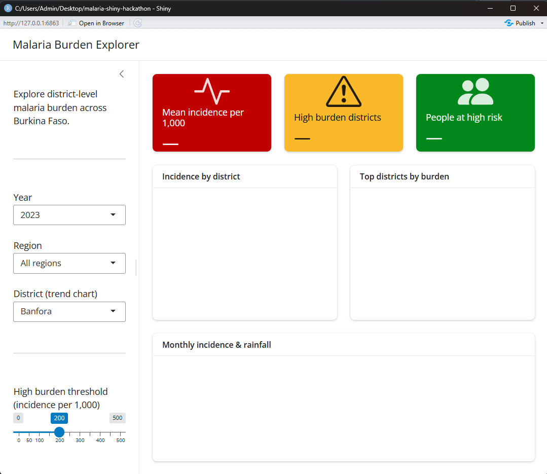
WarningNothing reacts yet
The inputs are visible but nothing happens when you change them — the server is still empty. That changes in the next section when we wire everything together with reactivity.
Exercise 1
Before moving on, try these on your own:
1a. Change the theme of one of the value boxes to "primary". What colour does it become?
1b. Add col_widths = c(7, 5) to the layout_columns() wrapping the map and bar chart. What changes?
1c. Add a card_footer() below the card_body() in the trend chart card with the text “Source: Simulated data for training purposes”.
CautionShow solution
1a. Replace theme = "danger" with theme = "primary" on any value box:
value_box(
  title    = "Mean incidence per 1,000",
  value    = "—",
  showcase = bs_icon("activity"),
  theme    = "primary"     # changed from "danger"
)
1b. Add col_widths to layout_columns():
layout_columns(
  col_widths = c(7, 5),   # map gets 7/12, bar gets 5/12
  card(...),              # map card
  card(...)               # bar chart card
)
1c. Add card_footer() after card_body():
card(
  full_screen = TRUE,
  card_header("Monthly incidence & rainfall"),
  card_body(
    plotlyOutput("trend_chart", height = 300)
  ),
  card_footer(            # add this
    "Source: Simulated data for training purposes"
  )
)
6.5 Pause and check ✅
Before moving to next section, confirm:
7 Stage 2: Data, Inputs and KPIs
7.1 Step 1 — Connect value boxes to data
Replace the three hardcoded value = "—" with textOutput() placeholders:
value_box(
  title    = "Mean incidence per 1,000",
  value    = textOutput("kpi_mean"),      # ← changed
  showcase = bs_icon("activity"),
  theme    = "danger"
),
value_box(
  title    = "High burden districts",
  value    = textOutput("kpi_count"),     # ← changed
  showcase = bs_icon("exclamation-triangle"),
  theme    = "warning"
),
value_box(
  title    = "Mean ITN coverage",
  value    = textOutput("kpi_itn"),       # ← changed
  showcase = bs_icon("shield-check"),
  theme    = "success"
)
7.2 Step 2 — Add server logic
Replace your empty server with this:
server <- function(input, output, session) {

  # ── reactive dataset ─────────────────────────────
  # filters once — shared by all outputs
  filtered_data <- reactive({
    malaria_data |>
      filter(
        year == input$year,
        input$region == "All regions" |
          region == input$region
      )
  })

  # ── update district when region changes ──────────
  observeEvent(input$region, {
    choices <- if (input$region == "All regions") {
      sort(unique(malaria_data$district))
    } else {
      malaria_data |>
        filter(region == input$region) |>
        pull(district) |>
        unique() |>
        sort()
    }
    updateSelectInput(
      session  = session,
      inputId  = "district",
      choices  = choices,
      selected = choices[1]
    )
  })

  # ── KPI outputs ──────────────────────────────────
  output$kpi_mean <- renderText({
    round(
      mean(filtered_data()$incidence,
           na.rm = TRUE), 1)
  })

  output$kpi_count <- renderText({
    df <- filtered_data()
    n_distinct(
      df$district[df$incidence >= input$threshold]
    )
  })

  output$kpi_itn <- renderText({
    paste0(
      round(
        mean(filtered_data()$itn_coverage,
             na.rm = TRUE), 1), "%"
    )
  })

}
7.3 Step 3 — Run your app
Click Run App. You should now see:
- Three value boxes showing real numbers
- Changing year updates all three instantly
- Moving the threshold slider updates the high burden count
- Changing region filters all KPIs
Exercise 2
2a. Add a fourth value box showing the name of the highest burden district. Use bs_icon("geo-alt") and theme = "info".
2b. Add a textOutput("sidebar_summary") below the slider in the sidebar. In the server add a renderText() that shows how many districts are currently selected.
2c. Move the threshold slider and observe kpi_count changing. What happens at threshold = 0? What about 500?
CautionShow solution
2a. UI:
value_box(
  title    = "Highest burden district",
  value    = textOutput("kpi_top"),
  showcase = bs_icon("geo-alt"),
  theme    = "info"
)
Server:
output$kpi_top <- renderText({
  filtered_data() |>
    group_by(district) |>
    summarise(
      mean_inc = mean(incidence, na.rm = TRUE)
    ) |>
    slice_max(mean_inc, n = 1) |>
    pull(district)
})
2b. UI — add below sliderInput():
hr(),
textOutput("sidebar_summary")
Server:
output$sidebar_summary <- renderText({
  paste0(
    n_distinct(filtered_data()$district),
    " districts selected"
  )
})
2c. At threshold = 0 all districts are high burden. At 500 none are — kpi_count shows 0.
7.4 Pause and check ✅
8 Stage 3: Map and Bar Chart
Goal: Replace both card placeholders with real interactive visualisations. By the end you have a choropleth map and a ranked bar chart that update together when inputs change.
NoteWhat you learn in this stage
leafletOutput()+renderLeaflet()for maps- Joining data to a shapefile
colorBin()for map colour paletteplotlyOutput()+renderPlotly()for chartsggplot → ggplotly()conversion- One
reactive()feeding multiple outputs
8.1 Step 1 — Add two helper functions
Add these below your data loading, before the UI:
# ── helpers ──────────────────────────────────────────

# colour palette for the map
make_pal <- function(values) {
  colorBin(
    palette  = "YlOrRd",
    domain   = values,
    bins     = c(0, 50, 100, 200,
                 300, 400, 500, Inf),
    na.color = "#f0f0f0"
  )
}

# top districts summary
top_districts <- function(df, n = 10) {
  df |>
    group_by(district, region) |>
    summarise(
      mean_inc = round(
        mean(incidence,    na.rm = TRUE), 1),
      mean_itn = round(
        mean(itn_coverage, na.rm = TRUE), 1),
      .groups  = "drop"
    ) |>
    slice_max(mean_inc, n = n) |>
    arrange(mean_inc)
}
NoteWhy helper functions?
make_pal() is called inside renderLeaflet(). top_districts() is called inside both renderPlotly() and potentially renderDT(). Writing them once outside the server keeps the server clean and avoids repetition.
8.2 Step 2 — Update the UI - Add class in header
Replace both placeholder cards with output containers:
layout_columns(

  # map card
  card(
    full_screen = TRUE,
    card_header(
      "Incidence by district",
      class = "bg-danger text-white"
    ),
    card_body(
      leafletOutput("map", height = "420px")
    )
  ),

  # bar chart card
  card(
    full_screen = TRUE,
    card_header(
      "Top 10 districts by burden",
      class = "bg-warning text-dark"
    ),
    card_body(
      plotlyOutput("bar_chart", height = "420px")
    )
  )

)
8.3 Step 3 — Add renderLeaflet() to server
Add below your KPI outputs:
# ── map ──────────────────────────────────────────────
output$map <- renderLeaflet({

  # summarise to one row per district
  df <- filtered_data() |>
    group_by(district) |>
    summarise(
      mean_inc = round(
        mean(incidence, na.rm = TRUE), 1),
      mean_itn = round(
        mean(itn_coverage, na.rm = TRUE), 1),
      .groups  = "drop"
    )

  # join to shapefile
  map_data <- district_shp |>
    left_join(df, by = "district")

  # colour palette
  pal <- make_pal(map_data$mean_inc)

  # build map
  leaflet(map_data) |>
    addProviderTiles(
      providers$CartoDB.Positron
    ) |>
    addPolygons(
      fillColor   = ~pal(mean_inc),
      fillOpacity = 0.8,
      color       = "#444444",
      weight      = 0.8,
      label = ~paste0(
        "<b>", district,    "</b><br>",
        "Incidence: ", mean_inc,
        " per 1,000<br>",
        "ITN: ",       mean_itn, "%"
      ) |> lapply(htmltools::HTML),
      highlightOptions = highlightOptions(
        weight       = 2,
        color        = "#222222",
        fillOpacity  = 0.9,
        bringToFront = TRUE
      )
    ) |>
    addLegend(
      pal      = pal,
      values   = ~mean_inc,
      position = "bottomright",
      title    = "Incidence<br>per 1,000"
    )
})
8.4 Step 4 — Add renderPlotly() to server
Add below output$map:
# ── bar chart ─────────────────────────────────────────
output$bar_chart <- renderPlotly({

  df <- top_districts(filtered_data())

  p <- ggplot(df,
    aes(
      x    = mean_inc,
      y    = reorder(district, mean_inc),
      fill = mean_inc,
      text = paste0(
        "<b>", district,      "</b><br>",
        "Region: ",    region,   "<br>",
        "Incidence: ", mean_inc,
        " per 1,000<br>",
        "ITN: ",       mean_itn, "%"
      )
    )
  ) +
  geom_col() +
  geom_vline(
    xintercept = input$threshold,
    linetype   = "dashed",
    colour     = "#333333",
    linewidth  = 0.6
  ) +
  scale_fill_gradient(
    low  = "#fdae61",
    high = "#a50026"
  ) +
  scale_x_continuous(
    labels = comma,
    expand = expansion(mult = c(0, 0.1))
  ) +
  labs(
    x = "Mean incidence per 1,000",
    y = NULL
  ) +
  theme_minimal(12) +
  theme(legend.position = "none")

  ggplotly(p, tooltip = "text")
})
Exercise 3
3a. Change the map background tiles from CartoDB.Positron to Esri.WorldGrayCanvas. Run names(providers) to explore options.
3b. Add ITN coverage as a second colour option. Add a radioButtons() to the sidebar:
radioButtons(
  inputId  = "map_indicator",
  label    = "Map indicator",
  choices  = c("Incidence"     = "mean_inc",
               "ITN coverage"  = "mean_itn"),
  selected = "mean_inc",
  inline   = TRUE
)
Then update renderLeaflet() to use input$map_indicator to select which column to colour by.
3c. Add col_widths = c(6, 6) to the layout_columns() — confirm both cards are equal width.
CautionShow solution
3a.
addProviderTiles(providers$Esri.WorldGrayCanvas)3b. Update renderLeaflet():
# use selected indicator
indicator <- input$map_indicator

pal <- make_pal(map_data[[indicator]])

addPolygons(
  fillColor = ~pal(map_data[[indicator]]),
  ...
)
3c.
layout_columns(
  col_widths = c(6, 6),
  card(...),   # map
  card(...)    # bar chart
)
8.5 Pause and check ✅
9 Stage 4: Trend Chart and Polish
Goal: Complete the dashboard with the rainfall-incidence trend chart and make it look professional with theming and polish.
NoteWhat you learn in this stage
- Dual-axis
plotlychart bs_theme()for professional themingtags$img()for logoinput_dark_mode()for dark/light toggledownloadHandler()for CSV export
9.1 Step 1 — Update the trend card in UI
Replace the trend placeholder:
card(
  full_screen = TRUE,
  card_header(
    "Monthly incidence & rainfall",
    class = "bg-info text-dark"
  ),
  card_body(
    plotlyOutput("trend_chart", height = "300px")
  ),
  card_footer(
    "Rainfall peaks July–August ·
     Incidence peaks September–October"
  )
)
9.2 Step 2 — Add renderPlotly() for trend
Add below output$bar_chart in server:
# ── trend chart ───────────────────────────────────────
output$trend_chart <- renderPlotly({

  # all years for selected district
  df <- malaria_data |>
    filter(district == input$district)

  p <- ggplot(df, aes(x = month)) +

    # rainfall bars — background
    geom_col(
      aes(
        y    = rainfall_mm / 3,
        text = paste0(
          "Month: ",    month.abb[month], "<br>",
          "Rainfall: ", rainfall_mm, " mm"
        )
      ),
      fill  = "#378ADD",
      alpha = 0.4
    ) +

    # incidence lines — one per year
    geom_line(
      aes(
        y      = monthly_incidence,
        colour = factor(year),
        group  = year,
        text   = paste0(
          "Month: ",     month.abb[month], "<br>",
          "Year: ",      year,             "<br>",
          "Incidence: ", monthly_incidence,
          " per 1,000"
        )
      ),
      linewidth = 1
    ) +
    geom_point(
      aes(
        y      = monthly_incidence,
        colour = factor(year),
        group  = year
      ),
      size = 2
    ) +

    scale_x_continuous(
      breaks = 1:12,
      labels = month.abb
    ) +
    scale_colour_brewer(
      palette = "Set2",
      name    = "Year"
    ) +
    scale_y_continuous(
      name     = "Monthly incidence per 1,000",
      sec.axis = sec_axis(
        transform = ~. * 3,
        name      = "Rainfall (mm)"
      )
    ) +
    labs(
      x     = NULL,
      title = paste0(input$district,
                     " — seasonal pattern")
    ) +
    theme_minimal(12) +
    theme(
      axis.title.y.right = element_text(
        colour = "#378ADD"
      )
    )

  ggplotly(p, tooltip = "text") |>
    layout(
      legend = list(
        orientation = "h",
        y           = -0.2
      )
    )
})
9.3 Step 3 — Add a theme
Add theme argument to page_sidebar():
ui <- page_sidebar(
  title = "Malaria Burden Explorer — Burkina Faso",

  theme = bs_theme(
    version    = 5,
    bootswatch = "flatly",
    base_font  = font_google("Inter")
  ),
  ...
)
9.4 Step 4 — Add logo and dark mode toggle
At the top of sidebar() add:
sidebar = sidebar(

  # logo — save your image as www/logo.png
  tags$img(
    src   = "logo.png",
    width = "100%",
    style = "margin-bottom: 10px;"
  ),

  # dark/light toggle
  input_dark_mode(mode = "light"),

  p("Explore district-level malaria burden
     across Burkina Faso."),
  hr(),
  ...
)
9.6 Step 6 — Run your complete dashboard
Click Run App. You now have a complete professional malaria burden dashboard:
- Header with title
- Sidebar with logo, dark mode, inputs, download
- Three reactive KPI value boxes
- Interactive choropleth map
- Ranked bar chart with threshold line
- Dual-axis trend chart
- Professional Bootswatch theme

Exercise 4
4a. Try three different Bootswatch themes — "cosmo", "minty", "sandstone". Which looks best with the malaria colour palette?
4b. Add a selectInput() to control how many districts appear in the bar chart:
selectInput(
  inputId  = "n_districts",
  label    = "Districts to show",
  choices  = c(5, 10, 15, 20),
  selected = 10
)
Connect it to top_districts(n = as.integer(input$n_districts)).
4c. Add a DT::dataTableOutput("data_table") in a new card below the trend chart. In the server add renderDT() showing district, region, incidence and ITN coverage for the filtered data sorted by incidence.
CautionShow solution
4a. Update bs_theme():
theme = bs_theme(
  version    = 5,
  bootswatch = "minty"   # try cosmo, sandstone
)
4b. Update renderPlotly():
df <- top_districts(
  filtered_data(),
  n = as.integer(input$n_districts)
)
4c. UI — add new card after trend:
card(
  full_screen = TRUE,
  card_header("District data table"),
  card_body(
    DTOutput("data_table")
  )
)
Server:
output$data_table <- renderDT({
  filtered_data() |>
    group_by(district, region) |>
    summarise(
      incidence    = round(
        mean(incidence,    na.rm = TRUE), 1),
      itn_coverage = round(
        mean(itn_coverage, na.rm = TRUE), 1),
      .groups      = "drop"
    ) |>
    arrange(desc(incidence)) |>
    datatable(
      rownames = FALSE,
      options  = list(pageLength = 10)
    )
})
9.7 Pause and check ✅
10 Deployment
Your dashboard is ready to share publicly via shinyapps.io — free hosting for Shiny apps.
10.1 Step 1 — Create a free account
Go to shinyapps.io and sign up.
10.2 Step 2 — Install rsconnect
install.packages("rsconnect")10.3 Step 3 — Connect your account
In RStudio: Tools → Global Options → Publishing → Connect
Or run in console:
rsconnect::setAccountInfo(
  name   = "your-username",
  token  = "YOUR_TOKEN",
  secret = "YOUR_SECRET"
)
Your token and secret are on your shinyapps.io dashboard under Account → Tokens.
10.4 Step 4 — Deploy
rsconnect::deployApp(
  appDir  = ".",
  appName = "malaria-burden-explorer-bfa"
)
Your app is now live at:
https://your-username.shinyapps.io/
         malaria-burden-explorer-bfa/
WarningFree tier limits
- 5 apps maximum
- 25 active hours per month
- Apps sleep after 15 min inactivity
Sufficient for training. For production use consider Posit Connect.
11 Next Steps and Resources
You have built a complete interactive malaria burden dashboard from scratch in two hours.
11.1 What you built
✓ bslib layout — page_sidebar, card, value_box
✓ Inputs — selectInput, sliderInput
✓ Reactivity — reactive(), observeEvent()
✓ Text output — renderText() + textOutput()
✓ Map — renderLeaflet() + leafletOutput()
✓ Chart — renderPlotly() + plotlyOutput()
✓ Theme — bs_theme() + bootswatch
✓ Deployment — shinyapps.io
11.2 Where to go next
Scale your code — as your app grows, split app.R into separate files:
global.R   ← packages, data, helpers
ui.R       ← ui object
server.R   ← server function
app.R      ← shinyApp(ui, server) only
Key resources:
| Resource | Link |
|---|---|
| Mastering Shiny | mastering-shiny.org |
| bslib docs | rstudio.github.io/bslib |
| Shiny gallery | shiny.posit.co/r/gallery |
| AMMnet community | ammnet.org |
TipKeep building
Adapt this dashboard to your own country or programme data. The patterns you learned today — reactive(), renderLeaflet(), renderPlotly() — are the same ones used in production dashboards at national malaria programmes across Africa.